CSS offers many choices when it comes to sizing an element. You can define HTML element’s size using absolute units or relative units. In this article, we will learn about the differences between absolute units. relative units, em, rem and when to use them.
Absolute units specify a fixed size value. Regardless of how big the screen is, the value will always be the same. So if you are looking to style a fixed sized element, you need to use absolute units. Some of the absolute CSS units are px, cm, mm, pt and etc.
On the other side, relative units are relative to the size of the parent element or the root HTML. These scalable units are great for responsive design. Some of the relative CSS units are em, rem, vw, vh and more.
Now you know the difference between absolute and relative units. Let’s take a deep dive into relative units and see what is the difference between em and rem.
What is em and When to Use It
em is a scalable unit that will adjust the font size of an element relative to its nearest parent element. When the font size of the parent element changes, the font size of its child will change automatically.
Consider the following example using em:
<style>
    .parent-element {
        font-size: 20px;
    }

    .child-em {
        font-size: 2em;
    }
</style>

<body>
    <div class="parent-element">
        <p>font-size of parent element is 20px</p>
        <div class="child">
            font-size of child element is 40px
        </div>
    </div>
</body>
Output:
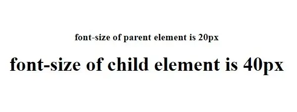
In the above example, we have the parent element set to 20px and the child element at 2em. em unit is relative to its parent, so in this case, 1em is 20px, so 2em is 40px. This is why the font size of the child element is 40px.
What is rem and When to Use It
Just like em, rem is also a scalable unit. But unlike em, rem is relative to the font size of the html element. This means if the root html has a font size of 15px, then 1rem would be 15px. If the font size of the root is not set, then the value of rem is set to the default, which is 16px for most browsers.
Let’s look at following example using rem:
<style>
    html{
        font-size: 20px;
    }

    .child-rem {
        font-size: 1.5rem;
    }
</style>

<body>
    <p>font-size of parent element is 20px</p>
    <div class="child-rem">
        font-size of child element is 30px
    </div>
</body>
Output:
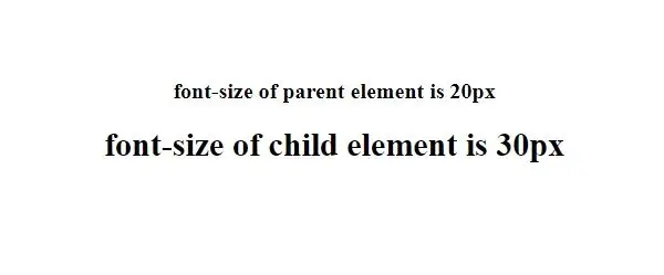
In the above html code, we have root html set to 20px and the child-rem is 1.5rem. rem unit is relative to the html element, so in this case, 1rem is 20px, 1.5rem is 20px * 1.5 = 30px.
When to Use em vs rem
rem is very simple and predictable. It will always scale with the root html element. So if you have an element that needs to scale up and down based on a single value, you should use rem. On the other hand, it is very difficult to scale the entire webpage based on a single value. If you need more control over a specific area or an element of the page, it is best to use em. This is because em is scaling with the nearest parent, this gives you more detailed control on a modular level.
Is em More Widely Used Than rem?
Most of the popular CSS libraries use rem more than em.. Some of the libraries include:
- Tailwind CSS
- Bootstrap
- Bulma
Why You Should Use rem Over em in CSS?
Even Google recommends rem for implementing material design. There are many reasons why em is not recommended, one of them being the complex hierarchy of nested elements. Take a look at below example and you will understand why it is better to use rem thanem.
<style>
    .parent-element {
        font-size: 20px;
    }

    .child {
        font-size: 2em;
    }
</style>

<body>
    <div class="parent-element">
        <p>This is parent element</p>
        <div class="child">
            First child
            <div class="child">
                Second child
                <div class="child">
                    Third child
                </div>
            </div>
        </div>
    </div>
</body>
Output:
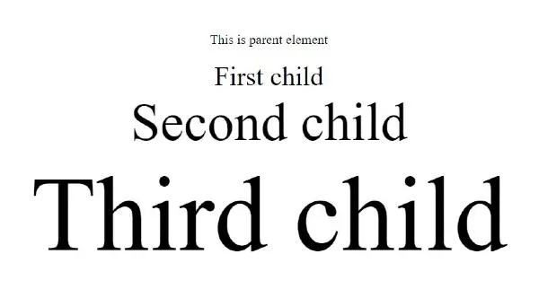
Are you surprised by the above html output? This is exactly why em is not as widely used as rem. Let’s take a deep dive and see how we ended up with a crazy output using em.
First child is set to 2em and its nearest parent has the value of 20px for font size, so the first child’s font size will be 2 * 20px = 40px. Up until now, everything seems normal, this is what we expect when using em. Now let’s take a look at second child, it is also set to 2em, but its nearest parent is first child, which has the value of 40px, so the second child’s font size is 2 * 40px = 80px. And things get even crazier wit third child, because its nearest parent is second child with a font size of 80px, its font size is 2 * 80px – 160px.
Now you see the problem with using em? You will create unexpected UI behavior if you are not careful when nesting elements that use em, rem on the other hand doesn’t have this problem. Let’s take a look at the same code but with rem instead.
<style>
    .parent-element {
        font-size: 20px;
    }

    .child {
        font-size: 2rem;
    }
</style>

<body>
    <div class="parent-element">
        <p>This is parent element</p>
        <div class="child">
            First child
            <div class="child">
                Second child
                <div class="child">
                    Third child
                </div>
            </div>
        </div>
    </div>
</body>
Output:
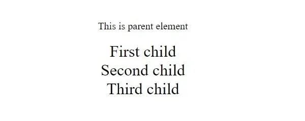
As you can see from the above output, font size is consistent across all the child elements, including the nested ones. This is one of the reasons why rem is more popular than em.
Which is Better? em vs rem?
There is no better scalable unit in CSS, it really depends on what you are comfortable with. The biggest problem with em is the linear compound effect of its value as the level of nesting increases. If you want to control elements on the modular level and are willing to work around this problem, then you should try em. On the contrary, if you want consistent result with styling and scaling, then you should use rem.